



how commercial kitchen design shapes what guests feel.
Commercial kitchen design decides ticket times, plate quality and server pace. Here is how the back of house shows up at the table.
insights · space · 09 nov 2026 · 7 min
Signage tends to get designed last, once the money is gone. Here is what restaurant signage has to do at the curb, at the door and inside the room, plus the signs nobody remembers until opening week.
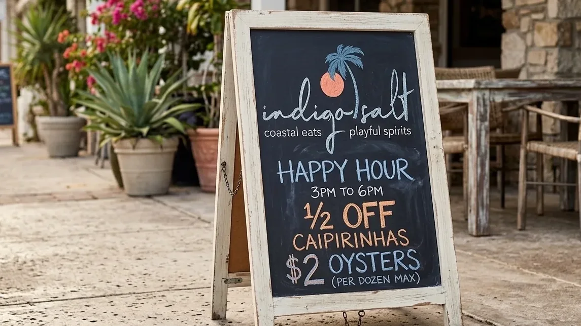
Good restaurant signage does three jobs. It gets a stranger to stop, it gets them through the right door, and it moves them through the room without asking anyone for help. What works is legible, lit and placed where people actually look. What doesn't work is a logo blown up to fit a facade, a front door with no hours on it, and a dining room that relies on the host to explain everything. What people miss is the quiet layer: the restroom, the pickup shelf, the patio rules, the labels on the walk-in.
We don't treat signage as decoration that goes up the week before opening. We treat it as part of the build, drawn alongside the floor plan and the brand. Done that way, it disappears into the room and simply works. Done last, it ends up as printer paper and painter's tape.
Start with the guest who has never heard of you. They are driving past at dusk, or walking from a parking garage, or standing on the sidewalk deciding between you and the place two doors down. Your sign has a couple of seconds to tell them three things: what you are, that you're open, and where to go in. Anything beyond that is noise at that distance.
Then there is the guest who already chose you. They need different answers. Where do I order? Is this the line for pickup or for tables? Can I seat myself on the patio? Where is the restroom? Every one of those questions, left unanswered by a sign, becomes a question for your staff. And every question for staff is a host who isn't greeting the next party, or a bartender who stops mid-pour to point down a hallway.
So restaurant signage is really two systems that share one brand. The outside is for persuasion and arrival. The inside is for movement and permission. Design them as one family of type, color and material, but write and place them for completely different moments.
The most common exterior mistake is taking the logo off the business card and scaling it up. A mark built for a menu cover often has thin strokes, tight letter spacing and a script that reads beautifully at arm's length. At a hundred feet, at night, through a windshield, it turns into a smudge. The exterior version needs to be drawn for distance: heavier weight, more air between letters, enough contrast against the building to survive glare and shadow.
Lighting is the second miss. A gorgeous painted sign that nobody can see after sundown is a daytime sign, and dinner happens after sundown. Letters lit from behind, a gooseneck lamp over a painted panel, a single neon word in the window. Pick the method that fits the brand, but decide early, so the electrician runs power to the right spot instead of stapling surface conduit up the brick after the fact.
Third, say what you are. A one-word name with no descriptor works for a place that already has a following. For a new room it asks too much of a stranger. A small secondary line under the name (tacos, wood-fired pizza, taproom and kitchen) does the explaining so the name doesn't have to.
And check the rules before anyone falls in love with a drawing. Many leases carry sign criteria covering size, placement and even lighting. Cities have sign ordinances and permits of their own. A blade sign that projects too far, or letters that sit outside the approved band on the facade, gets redrawn, usually on a deadline you don't have.
The door is the hinge. It is the one surface every guest touches, and it usually carries a sticker sheet of card logos, a delivery app decal and a handwritten hours card. Put the hours on the door properly, in the brand's type, with a way to change them cleanly. Make it obvious which door is the entrance, because in a corner building with two sets of doors, guests will pull the locked one every time.
Inside, the failure is almost always about order of operations. Counter service lives or dies on one question: do I order here or sit down? If the answer isn't clear from the threshold, people stand in the middle of the room and block the path from the pass to the tables. One clear sign over the register, readable from the door, does more than another body on the floor.
Menu boards are signage too, and they get treated like a printed menu made huge. They aren't. A guest reads a board from eight or ten feet away while standing in a line that is moving. Fewer items, bigger type, prices aligned so the eye can scan, and categories that match how the kitchen actually fires. The printed menu can carry the detail. The board carries the decision.
Then there are the signs that should never exist. The laminated note by the register that says the card reader is down. The paper arrow pointing to the restroom. The 'please wait to be seated' printed in a default font from the office computer. Each one is a design gap your staff filled with whatever was on hand. They work. They also tell every guest the room was finished in a hurry.
Ask an owner to list their signage and you get the facade, maybe a menu board. The full list is longer, and the forgotten items do the most daily work. Restroom signs that are legible and compliant. The pickup shelf for to-go orders, and the delivery drivers who come in looking for it. Patio signs for seating rules and closing time. The 21-and-up line at a bar entrance. Parking, and the path from it to your door.
Then the back of house, which guests never see and staff read all shift. Labels on the walk-in shelving. Station names on the line, so a new cook knows where the garnish lives. The date-labeling rules posted where prep happens. A handwashing sign at every sink. An allergen protocol at the pass. This is wayfinding for your team, and it decides how fast someone new becomes useful.
Here is a worked way to see the cost. Say a delivery driver walks in, can't find the pickup shelf, and waits at the host stand for ninety seconds while the host finishes seating a four-top. Say that happens thirty times a night. The host has lost forty-five minutes to a missing sign. At $16 an hour, that's $12 a night, or $4,380 across a year of open doors. And that ignores the bigger cost: the party standing at the door who wasn't greeted.
Walk it as a stranger. Park where a guest would park, at the hour your dinner crowd arrives, and approach the building cold. Can you read the name from the street? Can you tell where the door is? Is anything lit? Then do it again in daylight, because a lunch guest sees the same facade through completely different glare.
Then watch real people. Soft opening is the best signage test you will ever run, because friends and family behave exactly like strangers the moment they step into an unfamiliar room. Stand out of the way and note every time someone asks a staff member where something is. Each question is a sign you still need. We put this on the list in our guide to the restaurant soft opening, right alongside testing the POS and the kitchen tickets.
Finally, put the signage on the drawings, not the punch list. When signage + wayfinding is planned with the floor plan, the power gets run, the blocking goes into the walls before drywall, and the type matches the menu and the website. That's why we handle it as part of commercial interior design rather than a vendor order placed after the paint dries. Copper is the sign people photograph. Oak is the sign that keeps the line from forming in the wrong place.
Your name, plus a short line saying what you serve if the name doesn't make it obvious. Hours, specials and payment details belong on the door or a window panel, closer to eye level. The farther away a guest reads a sign, the fewer words it can carry.
If you serve dinner, yes. A sign that disappears after dark stops working during dinner service. The method can be modest, like a lamp over a painted panel or a backlit window, but plan the power before the walls close.
Alongside the floor plan and the brand, not after construction. Signs need power, blocking in the walls and approval from the landlord and the city, and all of that is easier before the drywall goes up. Late signage is how a room ends up with surface conduit and taped paper.
They do, for one job: a changing message at walking speed, like happy hour or a daily special. They work best when the board is built in the brand's materials and keeping it fresh is someone's actual job. A board with a new message every day gives regulars a reason to look.