

hello, DiVa!
a getaway in every cup.
A dirty soda pop-up, dressed for the Riviera. We designed the mark, the colors, the cup stickers, the travel posters and the guide that keeps them in line.
- the business
- A dirty soda pop-up
- what we made
- Brand identity, packaging, signage
- in hand
- Cup stickers, travel posters, a brand guide
the brand
the riviera, to go.
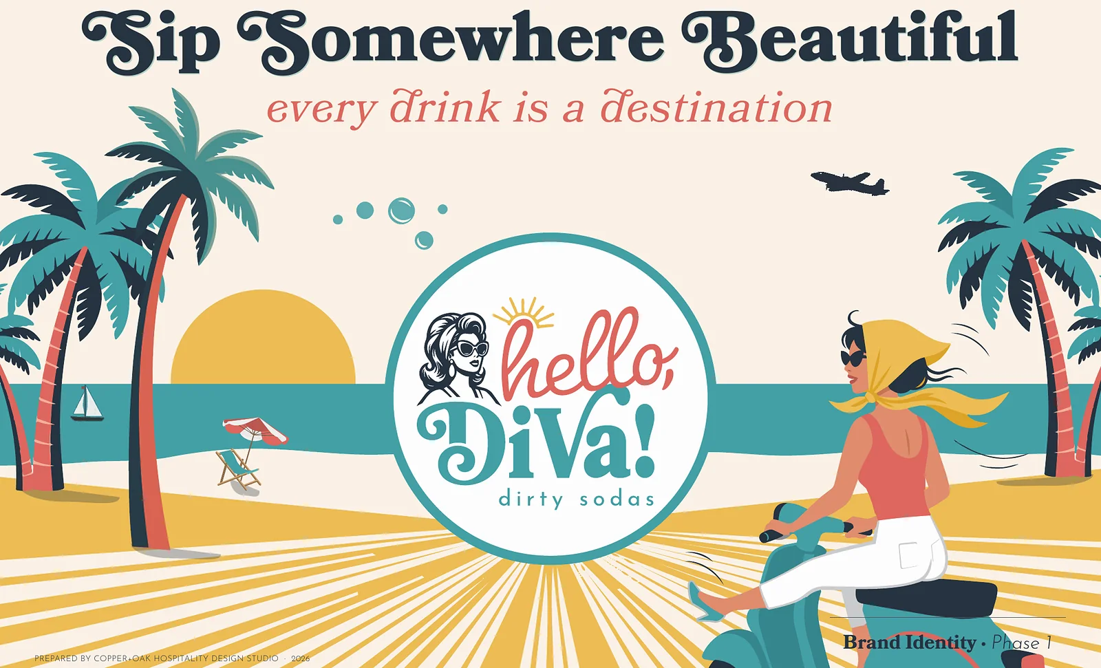
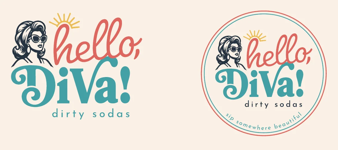
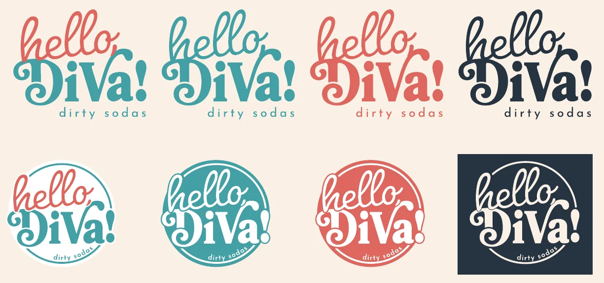
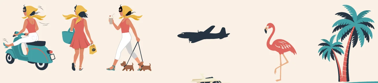
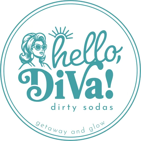
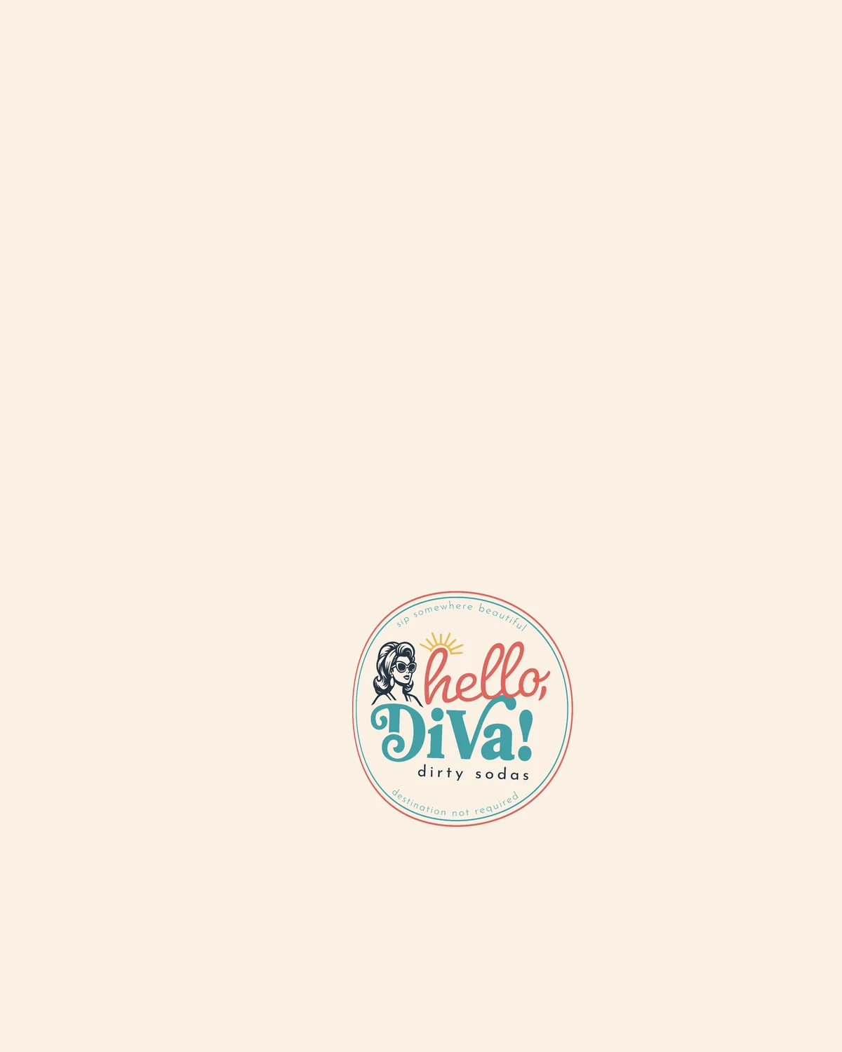
A dirty soda is a small luxury, so the brand plays it big: a diva in oversized sunglasses and a world lifted from old travel posters. The mark sets hello in coral script over DiVa in teal, with the diva beside it.
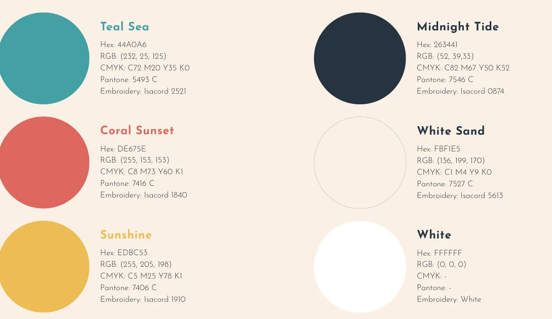
The wordmark comes in eight lockups, flat and round, light and dark. Six inks hold every piece together: Teal Sea, Coral Sunset, Sunshine, Midnight Tide, White Sand and plain white.
the cups
a stamp on every cup.
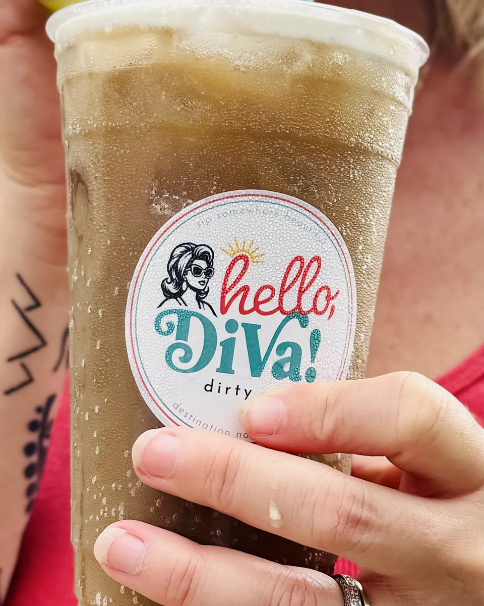
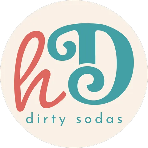
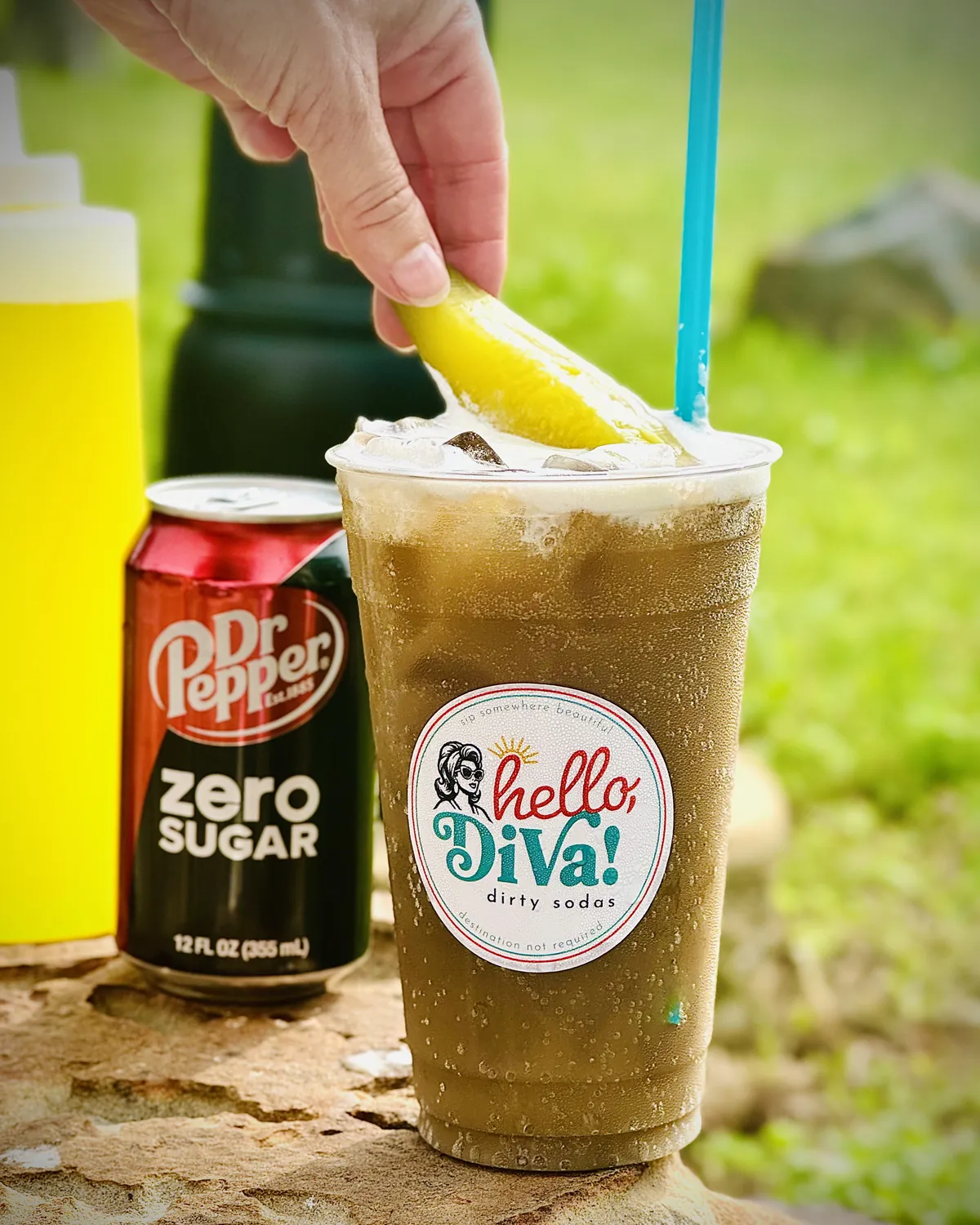
The brand rides out on the cup. Six stickers do the work of a postcard: the full mark, three round badges, the diva on her own and the hD monogram.
Each one carries a line of its own. Sip somewhere beautiful. Destination not required. Getaway and glow.
the posters
wish you were here.
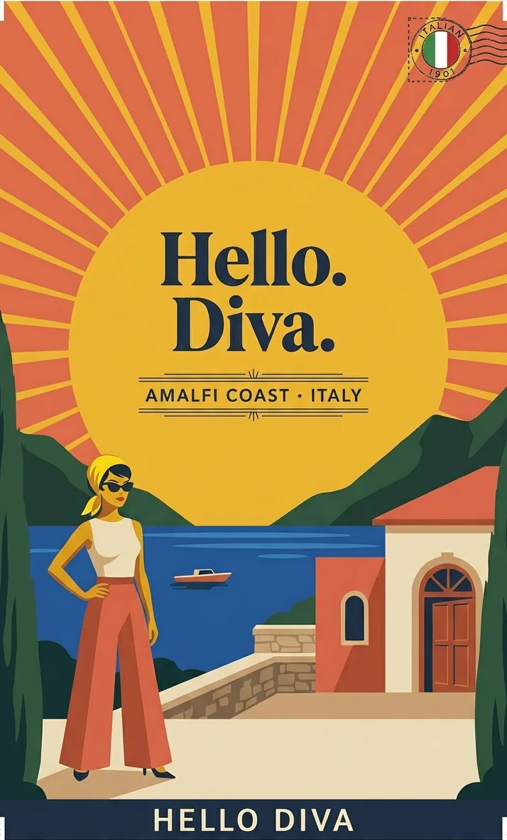
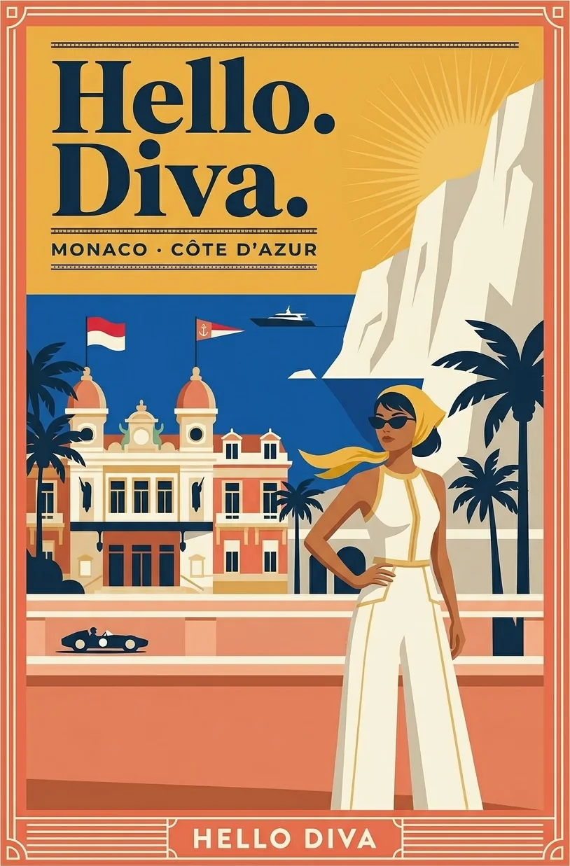
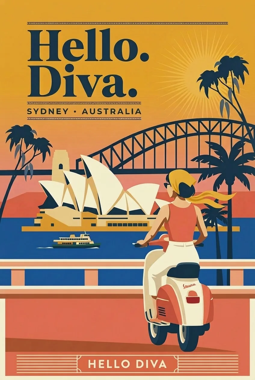
The posters sell the trip, not the drink. Amalfi, Monaco and Sydney, each set in the manner of a vintage travel poster, each with the diva already there.
Every city gets its own skyline and the same name along the bottom.
Copper+Oak designs brands, spaces and the systems behind them for independent hospitality in Dallas–Fort Worth.