



why is my restaurant slow? an operator's diagnostic.
Most slow restaurants do not have a food problem. They have a visibility problem, a drift problem, or both. A twenty-minute diagnostic.
insights · systems · 12 oct 2026 · 7 min
A menu is the only piece of design every guest reads before they spend money. Here is how we build one that sells the right dishes and still runs clean on a Saturday night.
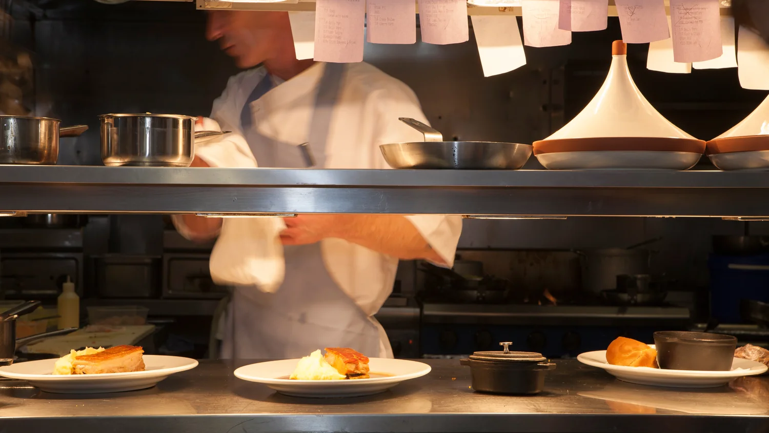
Restaurant menu design drives revenue when three things line up: the layout points guests at the dishes that make money, the prices are set from real plate costs instead of what the place down the street charges, and the kitchen can actually execute every line on it at full volume. Miss any one of those and the menu becomes a liability you print a hundred copies of.
Most menus get treated as the last thing before opening. Somebody drops the dish names into a template, picks a font, and sends it to print. Then the food cost runs eight points over budget and nobody can say which plate is bleeding. A menu is a sales document. It should be built like one.
It controls what gets read first. Guests read a menu the way they read a page: top to bottom, left to right, one section at a time. There is no magic corner that sells whatever you put in it, so order is the lever. The first lines of every section get read. The eleventh line in a list of fourteen gets read by the patient few, and if your highest-margin dish is sitting there, you have hidden your best asset.
It controls how long ordering takes. A menu with ninety items slows the table, slows the server, and slows the turn. Shorter menus order faster, cook faster, and waste less. We would rather run eighteen dishes that all sell than forty where twelve exist to make a vendor rep happy.
It controls what the kitchen can hold. Every item on a menu is a line on a prep list, a spot in the walk-in, and a station someone has to cover. Design the page without counting the stations and you have written a check the line cannot cash at the second turn.
The most common mistake we see is pricing by comparison. Someone across town sells a burger for 16, so the burger goes on at 16. Nobody costed the brioche, the aged cheddar, the two ounces of sauce, the fries, or the ramekin of pickles that gets refilled twice. Then the burger sells three hundred a week and quietly takes the whole month down with it.
Work in dollars, not percentages. A 14 plate that costs 5 in food leaves 9 to cover labor, rent, and everything else. A 17 plate that costs 9 leaves 8. The second one looks more impressive on the menu and makes less money every time it fires. When you line up every dish by contribution in dollars, the menu starts telling you what to promote and what to cut.
Then look at what sells. Pull a month of mix from your POS and sort it two ways: units sold and dollars kept. The dishes that are high in both get the best real estate on the page. The ones that sell well and keep little get a recipe fix or a price move. The ones nobody orders and that keep nothing get killed, and three prep items disappear with them. That is the fastest profit work in the building and it costs nothing but an afternoon.
Before a single word hits a layout, we map every dish against the station that fires it. Grill, saute, fry, cold. If fourteen of twenty items touch the saute station, you have designed a bottleneck. On a quiet Tuesday nobody notices. On a Saturday at 7:40 with forty tickets on the rail, that station is the reason the dining room is waiting and the expo is apologizing.
Shared prep is the other half. One braise that shows up in a sandwich, a bowl, and a special is three menu items and one prep task. A menu built that way shrinks the walk-in, shortens the order guide, and makes the inventory count something a manager can finish before close instead of after it.
Here is the operator test for any new dish: can a cook on day four of training make it correctly at volume with a line over their shoulder? If the answer needs a caveat, the dish needs a redesign or it does not go on. That filter protects your food cost, your ticket times, and the thing guests actually came back for, which is the plate landing the same way it did last visit.
Typography first. Set the body in something readable at the light level of your dining room, not at the light level of your laptop. We test menus at the table, at night, under the actual fixtures. Nine point type in a candlelit room means every guest pulls out a phone flashlight, and that is a design failure dressed up as mood.
Kill the dollar signs and the leader dots. A row of dots running out to a price turns the page into a spreadsheet and trains guests to shop by number. Set the price close after the description, same size, same weight, no column. People read the dish, then the price, in that order, which is the order you want.
Descriptions should do work. Name the thing, name two or three details that matter, stop. Four lines of prose about a farm nobody has heard of slows the scan and makes everything around it harder to read. And the menu has to look like the room it lives in. The paper stock, the margins, the way the logo sits at the top, all of it belongs to the same system as the sign out front and the coasters on the bar. If you want the longer version of that argument, we laid it out in why your restaurant brand identity is a system, not a logo.
Drinks carry the margin that food cannot. A cocktail list built on three or four house spirits with shared modifiers pours faster, trains easier, and keeps the back bar from turning into a graveyard of half-empty bottles. Put the two drinks you most want to sell at the top of the list, where every guest who opens it starts reading.
Specials are where you test. A board or an insert lets you run a dish for two weeks without committing it to print, and the mix report tells you whether it earned a permanent spot. We treat the specials slot as the test kitchen for the whole program, which is part of what we build under menu + F&B when a kitchen needs more than a new layout.
One more thing about print. Build the menu so a price change does not require a reprint of everything. Set the file up with a clean grid, keep the per-page item count stable, and own the working file in-house. Menus change four or five times a year in a healthy restaurant. The design should make that a Tuesday morning task, not a two-week project.
Fewer than most operators think. For a full-service neighborhood spot, somewhere between eighteen and thirty items across all courses usually covers the range guests want without overloading the line. The real limit is your stations and your walk-in, not a number. If you cannot name the contribution in dollars of every dish, the menu is too long.
Review the mix quarterly and make small moves often. A full redesign makes sense when the concept shifts, the kitchen layout changes, or the mix shows that a third of the menu is not pulling its weight. Small, frequent edits beat an annual overhaul because they let you see what each change actually did to sales.
More, not less. A counter menu is read standing up, under time pressure, with people in line behind the guest. Legibility, item count, and the order of the board decide how fast the line moves and how much lands on each ticket. In a taproom with a short food menu, the board does the same job your server would do in a full-service room.
Round numbers read cleaner and signal a kitchen that is confident in its food. Prices ending in 9 or 95 read as value-driven, which is right for some concepts and wrong for others. Pick one convention and hold it across the whole menu. Mixing them looks careless and guests notice before they can say why.